

RAPID ELECTRIC INC.
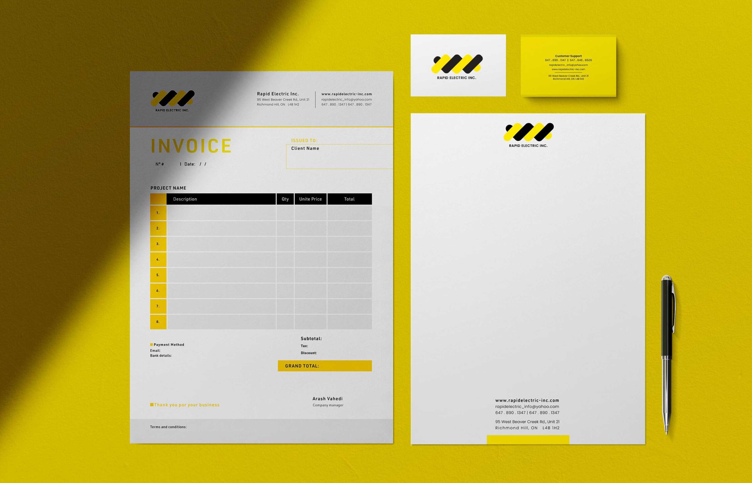
Rapid Electric Inc. is a full service Electrician company based in Toronto. The client requested logo design, stationary, and invoice. Below are the details.
Logo Design Analysis
- Shape and Symbolism:
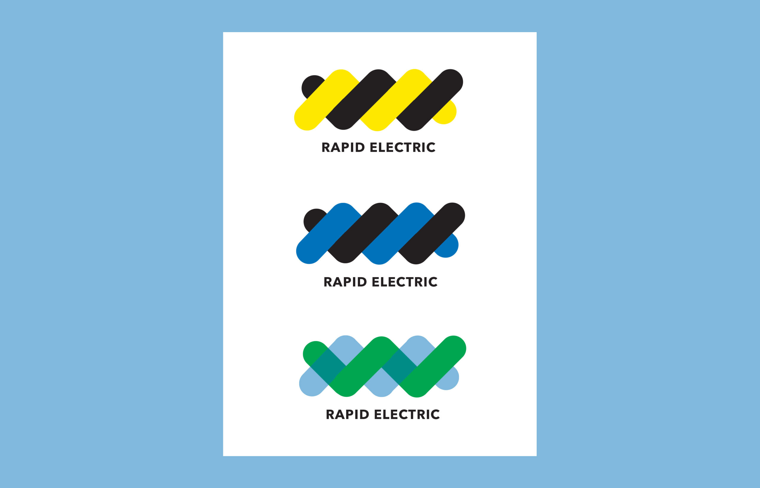
- The use of overlapping, rounded rectangles in alternating yellow and black creates a dynamic, energetic wave or current motif, symbolizing electricity and movement.
- The wave pattern is sleek, futuristic, and conveys innovation and reliability—key values for an electrical services company.
- Colour Theme:
- Yellow: Represents energy, brightness, and optimism, aligning with the electrical services industry.
- Black: Denotes professionalism, strength, and dependability.
- The yellow-and-black combination is a high-contrast, attention-grabbing palette, ensuring strong visual impact while also referencing industrial safety themes (e.g., hazard stripes).
- Typography:
- The clean, sans-serif typeface used for “RAPID ELECTRIC INC.” is straightforward and modern, reflecting clarity and professionalism.
- The text placement below the graphic element ensures the brand name remains the focal point.
Marketing and Branding Details
- Brand Identity:
- The logo establishes Rapid Electric Inc. as a modern, customer-focused, and safety-conscious company.
- Its minimalist and versatile design makes it suitable for a variety of applications, from digital platforms to printed materials.
- Applications:
- Stationery: The bright yellow and black elements can be seamlessly incorporated into business cards, letterheads, and invoices to create cohesive branding.
- Invoices: Adding the logo and matching design elements on invoices reinforces professionalism and brand recall.
- Banners: The bold logo is easily scalable for larger formats like banners, ensuring visibility and recognition.
- Target Audience Appeal:
- The combination of industrial themes (via colors and wave-like patterns) and clean design ensures the logo appeals to both residential and industrial clients.
- The vibrant design communicates approachability, while the structured layout ensures trustworthiness.
- Marketing Strategy:
- The logo is visually distinctive, making it ideal for use in advertisements, social media, and service vehicles to strengthen brand recognition.
- The color palette and logo can be extended into uniforms, ensuring brand visibility at service sites.
Overall, this branding design for Rapid Electric Inc. reflects the company’s professionalism, efficiency, and commitment to quality service, helping build trust and recognition in a competitive market. The slideshow displays the first logo suggestions, also.

