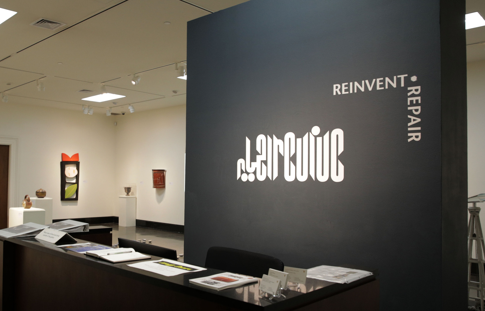


Ehya-Revive
Revive | احیا brings together the voices of seven women connected to Middle Eastern culture, who were each invited to choose a ceramic object from the Vanderbilt University Fine Arts Gallery collection and write a descriptive essay. These written interpretations were then handed to seven Middle Eastern artists, who, without ever seeing the original objects, created new artworks inspired solely by the essays. This unique collaboration shows how language can inspire artistic expression, offering a more accurate historical perspective and paving the way for a more inclusive future.
This exhibition is a part of the Tennessee Triennial, which focuses on the theme of RE-PAIR, exploring how objects, memories, cultures, and identities can be broken apart and reassembled in new, meaningful ways.
The logo draws inspiration from Kufi calligraphy, blending Arabic and English letters into a unique design.
Here’s a detailed breakdown for branding and design purposes:
- Custom Typeface: The typeface is heavily stylized, with geometric and sharp angular elements.
- Symmetry: The design leverages symmetry, making the wordmark visually balanced and intriguing, perhaps even with an ambigram-like quality (readable upside-down or as a reflection).
- Monochromatic Black: The use of solid black adds boldness and simplicity, ensuring high contrast and readability while maintaining elegance.
2. Message & Theme
- Playful Yet Sophisticated: The experimental style suggests creativity, modernity, and innovation.
- Potential Interpretation: If the name is “Revive,” the mirrored or reflective design could symbolize renewal, reflection, or transformation—aligning with the concept of revival.
3. Visual Characteristics
- Cohesion: The logo design creates a cohesive and integrated look by connecting the letters into a seamless structure.
- Memorability: The unique design ensures it stands out and becomes easy to recognize.
4. Versatility
- Application: The clean, monochromatic design allows for easy application across various mediums, including print, digital, merchandise, and signage.
- Scaling: The bold structure ensures readability even when scaled down, which is advantageous for branding on small items like business cards or social media icons.
Category:
Project Date:
JANUARY-JUNE 2023Date:
August 16, 2024

